Tuesday 16 December 2014

Lines in photography


Lines play a huge role in photography and can be used for numerous purposes. By replicating the three dimensional world through a two dimensional medium, depth perception is lost  and so lines are a very important tool for recreating  a sense of depth and perspective. 


It’s important to note, that lines are not exclusively produced by actual physical lines in a photograph like below: 

A HDR I took in Manchester City Centre
Lines can be much more subtle. For example, they can be created by a contrast in colour tones, a contrast between light and dark focused areas of the image and more.


Diagonal lines  

in the western world we have a tradition of reading from left to right and when viewing a photograph we use a similar process, Scientists have discovered that when western people look at a photograph or a piece of art, we start at the bottom left corner and work our way into the rest of the image. In Asia the process begins from the opposite side, as they are trained to read from right to left. Using diagonal lines in a photograph to lead your viewer from the left in towards your subject is a great way of utilising this fact. Lines used in this manner are often described as leading lines. 

In the image below I used a blur tool over most of the ocean to reduce the focus, however I (used a mask on the layer I applied the blur with and) created a path between the bottom left of the image and the boat, allowing that part of the image to remain in focus. Which in turn created a leading line for the viewer to follow from the bottom left of the image towards the boat and into the rest of the photograph:

Lake Geneve, Switzerland
When numerous diagonal lines are used in an image they can be arranged so as to simulate a feeling of action within the image. 


Horizontal lines


Horizontal lines, especially when they span the full length of an image can convey feelings of calmness, stability and peace. They remind us of great horizons and vast expanses of water, however horizontal lines can be boring when unbroken. Although, this is easily solved by the addition of intersecting vertical lines of some form. For example, the way the colourful sails below break the line of the horizon. 

Dorset, UK

Another trick to accentuate horizontal lines, used in the image above, is to shoot landscape or even wider so as to prolong their length and exaggerate the feelings they can convey. 

Vertical Lines

Vertical lines are known to provide a sense of growth or power within in image. However they can also give a sense of rigidity to an image where as horizontal lines are more free flowing. 

The affects of vertical lines can be accentuated by shooting in portrait and also by configuring your composition to crop the lines before they end, this can give the viewer the notion that the subject is too big to be captured and provide the subject too with a sense of grandeur or strength. See how the tops of the trees have been cut off in the image below:

New Forest, UK

Thanks for reading ! Feel free to check out my website at: www.josephrigbyphotography.co.uk

Clone Stamp Tool

The clone stamp tool is a photoshop tool that allows you to, in affect to very quickly and easily copy one area of an image and paste it onto another area of an image. Below are a couple of images i have produced to show how well it can be used.

Here is an image of somebody's forehead with a tiny bit of eye brow in the bottom right I included for context.


These two images represent how the clone stamp tool may be used, the top image is pre-use and the lower image is after-use. Although I am using it here for portraiture work it is possible to incorporate anywhere. 

The basic controls are as explained below:


1) Select the icon as shown: 


2) Hold alt and click - to select the part of the image you would like to clone

3) let go of alt and click on the place you would like the cloned part of the image to be pasted.

Finished

However, you can improve the effectiveness of the tool by incorporating the use of brush sizes, hardness, softness and layer modes etc to tailor the results to your own needs.

Thanks for reading ! Feel free to check out my website at: www.josephrigbyphotography.co.uk

ISO and The Exposure Triangle


The exposure triangle is made up of three determining factors that control how much light a photograph is exposed to. It is important to understand these factors both individually and hoe they work as a unit to achieve any level of skill in photography. I will begin by explaining these factors individually:

Aperture

In each and every lens there is a hole through which light travels to reach either the film or the cameras sensor (if digital) in order to expose an image, this hole is called the aperture. The amount of light that can travel through a lenses aperture in X amount of time is dependant on the apertures diameter. Apertures with wider diameters allow more light to travel through them and smaller apertures allow less light to travel through them. 

Most lenses have variable diameters which means the size of the aperture is a controllable factor in determining the exposure of a photograph.

To help stop your brain from over working i’ll repeat it simply. In a lens there is a hole, if a hole is wider more light goes through it and if it is smaller less goes through. You control the size of the hole and how big or small it is affects how light or dark your image will be. The hole is called the aperture. 


To help your brain even more i’ve included some images below:

Aperture f/4

(smaller)

Slightly darker image


Aperture f2.8

(wider)

brighter image


You might be wondering what those units above mean; they are called F stops and are the unit of measurement for the size of the aperture. It is likely you will see them at any of the following measurements:

f/1, f/1.4, f/2, f/2.8, f/4, f/5.6, f/8, f/11, f/16, f/22, f/32, f/45, f/64, f/90, f/128, etc

Contrary to natural intuition (because things would be too easy otherwise) the smaller the number of measurement, the wider the aperture is. For example f/1 represents an aperture that is very wide and lets in a lot of light. Where as f/128 represents an aperture that is very very small and doesn’t let much light in at all. So small aperture = high number and bigger apertures = lower number.

For any mathematicians amongst us the f number N is given by: 

N = F/D where F is the focal length and D is the diameter of the aperture. So f/1 on a 50mm lens means the diameter of the aperture is 50mm or 5cm. 

The size of the aperture also affects an images depth of field but this isn’t related to exposure and so i’ll leave for another blog.

2) Shutter Speed

A cameras shutter is like a small curtain that lies in front of the film or the sensor. The curtain opens when a photograph is taken to allow light into the camera in order to expose the image. The longer the shutter is open the more light can pass through. Usually the shutter only needs to be open for very short amount of time i.e. 1/200 of a second but in low light or to create certain effects a cameras shutter can be open for much longer periods of time i.e. 1 minute or much longer and this is when a tripod is needed to keep a camera steady. 

Below are a few images to display what affect the shutter speed have on the exposure of an image:


Shutter speed:

5 seconds

f/11

ISO: 100
Shutter speed:

20 seconds

f/11

ISO: 100 
 3) ISO

ISO is a digital sensors or a films level of light sensitivity. The higher the ISO the lighter your exposed image will be and the lower the ISO the darker it will be. A downside to ISO is its tendency to increase the noise of an image, the higher the ISO the more noise that will be created.

Each camera has a base ISO level that tends to 100. The ISO of film stock is built into the film when its made and can’t be changed. After ISO 100 the value goes up in geometric progression, meaning it doubles each time from ISO 100 to 200, 400, 800, 1600, 3200, 6400, 12800 and so on. It’s important to know that each progression represents a doubling the cameras or film stock sensitivity. I.e. ISO 200 is twice as sensitive as ISO 100 and ISO 800 is quadruple as sensitive as ISO 200. (finally something that makes a little sense)

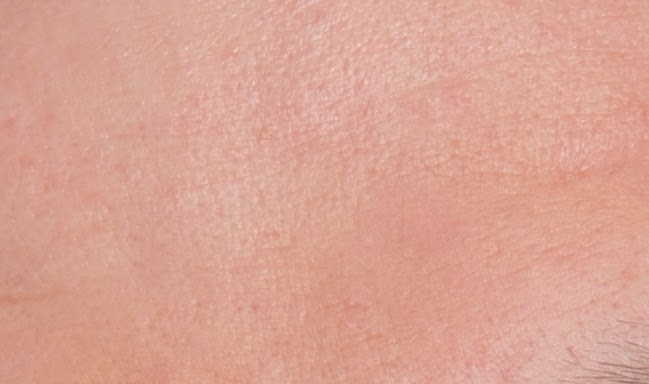
However, the higher a camera sensors top ISO value, the lower the noise will be at any given value. For example, if a cameras top ISO value is 1600 then at ISO1600 on that camera there will be much more noise then ISO 1600 on a camera that has top ISO value of ISO 128,000 below I have included an image that displays the noise of a high ISO image. 

 ISO 3200

Below I have included a cropped version of one of the posters seen in the image to the left in order to display the noise that a high ISO can produce.

However, admittedly this was taken on a camera (5d Mark 3) with great light sensitivity so the noise impact at ISO 3200 is reduced from the usual amount.


Conclusion

With each changing setting, situation or assignment the priorities of a photograph change. A skilled photographer is able to meet these changes and one of the most rudimental skills in photography is to be able to balance the exposure triangle in a way that suits your needs. There are several ways to reach the same exposure value and below are some theoretical examples to assist you on understanding how you can utilise this fact.

For example, if you are on a journalistic assignment taking snapshots of a person or an event with the need for everything to be in focus and also too little time or flexibility to carry around and set up a tripod, the best thing to do is increase your ISO. This will allow you to take photographs with smaller apertures (with more in focus) and at faster shutter speeds. 

Or, if your taking a beautiful landscape and want everything in focus ( small aperture) when the light is low and you have bags of time and a tripod at your disposal. Here, there is no need to make any sacrifice in the quality of your image by increasing the ISO. Instead you can keep your small aperture (around f/16 will keep most things in focus) move your ISO down to it’s base level (ISO 100) and put your camera on a tripod for a long exposure. This allows a long time for the light to travel on to your film stock or cameras sensor and can produce a well exposed image. 

For the last example, if it’s bright daylight and you want a shallow depth of field( achieved with a wide aperture i.e. 1.4) but theres your image is over exposed, you can keep a wide aperture and compensate by moving your shutter speed up to a very short amount of time i.e. 1/8000 of a second.

Thanks for reading! feel free to check out my website at: www.josephrigbyphotography.co.uk

Sunday 7 December 2014

Colour Temperature Explained

Colour temperature is a description of the colour of light, and more specifically the colour of a source of light on spectrum of blue to orange. With candle light producing a warm and orange hue falling in at around 1800K and daylight being much cooler and bluer, falling in at around 5500K (The unit of measurement I am referring to is the Kelvin, denoted by its symbol: K). Much cooler light than daylight will measure in at much higher Kelvin numbers i.e 7000K-10,000K and warmer light at much lower kelvin numbers i.e. 1000K-3000K. All light will fall in the range between 0K and 10,000K. 

Here is a diagram of it’s spectrum:


However, when managing the colour temperatures of your images, cameras don't always have to be balanced to produce accurate results, if you set your camera to 1800K for example, it will think it is shooting at candle light. To compensate for all of the orange light that comes from candles it will add lots of blue to the image so that any white in the scene still appears as white rather then turning orange from the candle light. However, if you tell your camera to shoot at 1800k when really you are shooting with incandescent light at 2800k it will cause the scene to look more blue then it is in real life. The reverse of this phenomenon is also true. If you shoot at 10,000k when really the colour temperature of your scene is 7000k it will give the scene a warmish hue. I have provided some extreme examples below.


Playing with the colour temperature on your camera setting is a great tool to get creative with the colour of your images, slightly altering the hue of your shots can also help to provide some context or give meaning to your images. The same is true for colour balancing your shots on the pink to green scale, not only orange to blue. 

Thanks for reading ! Feel free to check out my website at: www.josephrigbyphotography.co.uk

Low key Lighting - Photography

Low Key Lighting

Low key lighting is a style of lighting that tends to be arranged with the purpose of creating dramatic and moody effects. Where the lighting ratio of a high key set up can be approaching 1:1 it isn’t uncommon for a low key set up to have a lighting ratio of around 1:8, creating large amounts of contrast and shadows. 

Low key lighting set ups are often used in portraiture and product photography and are perfect for accentuating the form and texture of a subject. 


Here is an example of some low key portraits I took for my portfolio:  


Thanks for reading ! Feel free to check out my website at: www.josephrigbyphotography.co.uk

High Key Lighting - Photography

High key Lighting

High key lighting is when a lighting set up is arranged so as to reduce the amount of contrast in the scene and achieve a balanced lighting ratio. High key lighting set ups generally bring with them an up beat feel and are usually focused on keeping the background with a similar exposure to the subject. 

Here is an example of a high key headshot I produced for Martin Minshall, based loosely on David Bowie’s Aladdin Sane album cover:


Thanks for reading ! Feel free to check out my website at: www.josephrigbyphotography.co.uk

Angles: in relation to Context Meaning and Emotion

The use of angles is a powerful weapon in any photographers arsenal. By simply moving the position of the camera in relation to your subject it can affect the composition, the context and the interpreted meaning of a photograph. The most obvious example is the sense of dominance and grandeur that a lower camera angle can lend to a subject. 


Above is a fairly straight image of the ferris wheel in Manchester, UK. This angle is arguably the most "realistic", providing a full context by including the surrounding environment of the ferris wheel. Even here the structure exerts a sense of dominance due the it's sheer scale in contrast to it's neighbouring buildings. Now take a look at the image below:


By photographing the subject from a closer, lower angle, the ferris wheel has been isolated from it’s surroundings which alters the context of the image. Where as before, we had a fairly good understanding of the ferris wheels surroundings and buildings to provide context of its scale, all of that has now been lost, giving a sense of mystery to the image. 

However, the lower angle this photograph has been taken from seems to strengthen the sense of dominance of the subject, it’s towering metal frame scaling high into the air can translate feelings of intimidation to the viewer. 

Now, to me and you this is just a ferris wheel, something associated with fun and innocent entertainment. But imagine this wasn’t the case, and imagine this image was taken from a film still or a series of images from a photographers project and imagine that within this context the ferris wheel was a mark of oppression. A symbol of grandeur and prowess of a dominant and unsavoury power. In this context the feelings created from shooting from a lower angle are even more exaggerated. 

And finally, what if I told you that this ferry wheel isn’t actually a life sized model, but a small 6ft version that lives in my model obsessed uncles garage and was photographed against a black ceiling. At this point you understand that if I had photographed this from a different angle and perhaps with a wider lens then the image would have translated a completely different reality, completely different emotions and an entirely different context. This wasn’t the case, it is in fact a real ferris wheel but your starting to get the picture of how affectively angles can be used. 

Take a look at the picture below:


This time feelings of grandeur or dominance aren’t the feeling Im trying to translate. This time I’m creating an article for a social media based media company to pull as many people as to the page as possible. I’m writing an article called: Photos of the top 10 weirdest tourist attractions in Manchester. Notice how much information has been removed from the scene by taking the photograph from such an obscure and unrecognisable angle. Especially when the image will be shown as a small thumbnail on a Facebook newsfeed, people are going to wonder, what an earth is that ? The feelings of let down and being cheated, along with the question of what am I doing with my life ? come only after you have clicked on the link and scored us a dollar from our sponsors. Again all of this is make believe but the purpose of shooting at this angle would be to create a sense of mystery. 

However, the myriad of emotions, context and meaning to be translated from using different angles doesn’t end at creating a sense of mystery or dominance. Look at this image below, taken as a still from “The Grand Budapest Hotel” (one of my favourite films, love me or hate me for it):


This image is presented as a POV and is used so as to suggest upon the powerlessness and vulnerability of the subjects. For some reason, the accentuation of their helplessness seems also to make the characters more likeable.

Thanks so much for reading ! Feel free to check out my website at: www.josephrigbyphotography.co.uk

Saturday 6 December 2014

Photoshop - Layer Manipulation and Restoring Symmetry to the Face


Above is the original image of a headshot I took for a client. Unfortunately, in this photograph her left eye was a little squinty due to the power of the flash heads. To make up for my own short comings I decided to try and remove the squint of her left eye. 

So, I began searching for a method to make her face more symmetrical. After a few moments of consideration I duplicated the original image, mirrored it and rotated it slightly, in this way I was able to match it's position fairly realistically. I then added a layer mask to the second, mirrored and duplicated image and began using the brush tool to mask out parts of the image I didn’t want. By editing the opacity, shape and hardness of the brush tool, I was able to use it more effectively. I tended to use very soft strokes so the gradation between the added layer and the original image below became invisible.

I then continued with the manipulation of the image by removing any blemishes with the healing brush tool and editing the colour slightly with a plug in filter. However i found the effects were a little strong and decided to reduce the opacity of the filter to 14%, giving it a much more subtle effect. below is the final result:

Thanks for reading ! and feel free to check out my website at: www.josephrigbyphotography.co.uk

Layers and Blend modes in Photoshop

A brief insight into how I created a couple of improvised album covers on photoshop using layers, the shape tool and blend modes.


I began creating my “Alt-J” album cover by first taking the image ( a photograph I took at the hot springs in Rotorua, NZ) above and duplicating it 5 times. I proceeded by using the custom shape tool on each of the duplicated layers to make selection paths and cut my selected areas from the image, Each time I pasted the part of the image I had cut  out, back on top of the background layers. At this point I had pasted one full circle, two outlined circles and one outlined triangle; each with their separate layer and I arranged them so they were above my two original unedited background images ^. 

This is when I began altering the layer modes of the shapes and top background image, I also used various adjustment layers and the brush tool to mask out areas of each of the layers and adjustment layers I did not want to affect the image. After i was happy with the results, I added the text and below is the final version:


Crop Factors and Why Does The Size of My Sensor Matter ?

Crop Factors and Why Does The Size of My Sensor Matter ?

I will begin by describing a digital sensor, a digital cameras sensor is the part of the camera that actually records the image, it exists behind the lens and when you press the shutter all of the light in front of the lens pours onto the sensor and is recorded by millions of light sensitive spots called photosites, the bigger a sensor is and the more photosites there are, the higher quality the recorded image will be. 

So when digital cameras first came into the mainstream a lot of photographers who previously shot on film were confused, mainly because their lenses on these brand new digital cameras weren't behaving normally. For example, if a photographer took a photograph with a 50mm lens, it’s quite likely the resulting image would have the angle of view of a 75mm lens. 

So, to help photographers understand the transition between film and digital a little better, a decision was made to call any digital sensor of the equivalent size to 35mm film a full frame sensor, and any sensor that was smaller than 35mm film was given a crop factor depending on how small the sensor was. I.e. a sensor with a crop factor of 1.5 would be larger than a sensor with a crop factor of 2. A sensor with a crop factor of 2 is half the size of a full frame sensor and so on. 


So, when you take a photograph with a 35mm lens your camera should have recorded an image with an angle of view of around 62 degrees. However, if you take a photograph with a 35mm lens on a camera that has a sensor with a crop factor value of 1.5, the angle of view that will have been recorded would be more like 93 degrees. This is because smaller sensors record less of the image and so to balance this phenomenon out, you need to use wider lenses. Therefore to capture a field of view of around 62 degrees on a camera with a crop sensor of 1.5, you would need a lens thats 23.5mm. Are you with me ?


So, the image above I photographed in London on a full frame camera with a 24mm lens. The box in the middle shows the area that would have been captured had I used a 24mm lens with a camera that had sensor with a crop factor of 1.5. 

However, had I used a camera that had a crop factor of 2 even less would have been captured. So there you have it, a small explanation into crop factors and sensor size.

Thanks for reading ! 

Feel free to have a browse of my website @: www.josephrigbyphotography.co.uk

Focal Lengths and The Difference Between Wide and Long Angle Lenses

Focal Length- (noun)

-the distance between the centre of a lens or curved mirror and its focus.
-the equivalent distance in a compound lens or telescope.

Lenses, in photography fall between a vast range of different focal lengths. With the widest commercial lens in production coming in at 6mm produced by Nikon and the longest commercial focal length coming in at 1200mm produced by Canon. 

The key thing to understand about focal lengths is that the wider the lens, the more of a scene you will capture and the longer the lens, the more zoomed in the image will be. I’ve included below a visual guide to help you understand:

For all of these images, the photographer would have been stood in exactly the same place. So, as you can see, the photograph taken with the 18mm lens covers a vastly more of the scene in front of the photographer than the photograph taken with the 300mm lens.

However, the focal length of a lens doesn't only determine how much of a scene is captured, it also has an influence on the way it is captured. Wider angle lenses tend to distort the perspective of space by exaggerating the size of anything in the foreground and compressing the size of anything in the background. 

Below are two images taken of the same corridor in roughly the same position. 


It is clear to see that the top image seems to have a much healthier and normal perspective on space with both the foreground and background being in good proportion. This is because the focused “focal length” of the human eye is around 50mm, and so the relationships of space produced by 50mm lenses are much more familiar to us. However, only when you look at the lower image, seen in relation to the top image can you see that the foreground looks much more spacious and the background looks a little compressed. The top image was taken with a 50mm lens and the bottom with an 18mm lens. 

Wide angle lenses are often used when photographing houses for estate agents or for any other form architecture. This is because, firstly, it isn't always possible to photograph inside of a building with a longer focal length because rooms are often too small. Secondly, they generously exaggerate the sense of space and perhaps grandeur within a building. 

Longer focal lengths  (longer than 50mm) however, compress space and are often used in portraiture. This is because when using a wide angle lens to photograph someones face it will distort their features, can make their head seem more oval and also exaggerate the size of their nose etc. Where as longer focal lengths, although they do still distort the perception of space, it is generally to a lesser extent and more often than not it will be “flattening” to the subjects features. I.e. if a subject has a big nose it will cause their nose to appear shorter. 

Below I have included two photographs, the first taken at 24mm and the second taken at 100mm. 

For both of these photographs, the model (my friend) had been standing in exactly the same position, and were taken seconds apart from each other. It is clear to see from this pair of photographs and the pair above, how drastically your choice of lens can affect the results of the captured image.

Thanks for reading !

Please feel free to check out my website at www.josephrigbyphotography.co.uk


Friday 5 December 2014

Colour vs Black and White

Colour Vs Black and White


Joel Meyerowitz spent a small part of his career trying to decide wether to shoot in colour or black and white. For two years, everywhere he went he carried two cameras with him, one was loaded with a roll of colour film and the other was loaded with a roll of black and white film. Every photograph he took, he would then repeat with his other camera. One day as he was observing some of the images he had taken during this period he realised, all black and white is, is the reduction of colour. Colour is information and so when a person shoots in black and white they are removing information from an image and with a loss of information comes with it a loss of context along with several other things. 

Yet many things can also be gained from shooting in black and white, one of them is the accentuation of form. Wether it’s the accentuation of form of the expressions on a persons face, or the accentuation of from on the bark of a beautiful tree or a magnificent building I believe that it can yield wonderful results. I believe also, that in particularly colour busy images, by converting to black and white you can sooth, calm and potentially salvage a photograph. Sometimes colour can distract from a subject rather then lend to it.


Below are a few images I chose to convert to black and white and why: 


To be honest, when i first saw this photograph it felt a little trashy, with the style of top and the red lipstick with a black background I felt as if it were trying to hard. However, the hat she was wearing seemed to carry the feeling of something from the 1920’s or 1930’s. To add some implied context to the image and restore a little simplicity and hopefully class I converted the photograph to black and white. Although a little cliche it seemed to provide the image with a nice harmony of both new and old.


Although these flowers offer some beautiful colours, I felt that to an extent, the existence of colour in the photograph comes at the expense of the form, texture and shape of these plants, which often go unappreciated. 

To view them through a photograph provides a unique opportunity to view them in black and white and get a feel for their texture etc. Hence the reason I converted the image.


However, although black and white can offer some incredible benefits, colour definitely has it’s place in photography.  The photograph below I found on the internet, it was taken to display the high levels of pollution in China that have resulted from it’s industrial revolution.  


It’s clear to see that the intended context of this image is completely lost by the removal of colour and is therefore obvious that this isn't an image that would benefit from a conversion to black and white. 

Below is another of my own images, I have titled this image serenity. A title that the colour blue lends to heavily. Blue is as you can see below, the colour of the sky and sea and is associated with calmness, coolness, relaxation, wisdom, serenity and for some it can translate even as the colour of heaven. The gradation of blues in this monochrome colour scheme lends beautifully to the overall harmony of the image and again, I believe that his image would not benefit from a conversion to black and white.        


So there you have it, my two cents on the endless debate of colour vs black and white. I think it’s clear that both have their time and both can produce wonderful results, I guess it’s up to the photographer and what he or she is trying to translate through their images. 

Below I have provided the search link of my favourite black and white photographer:


Along with a very famous photographer who throughout his career experimented with and championed the use of colour:


And finally a link to my own website: 


Thanks for reading ! :)